JUL 2020
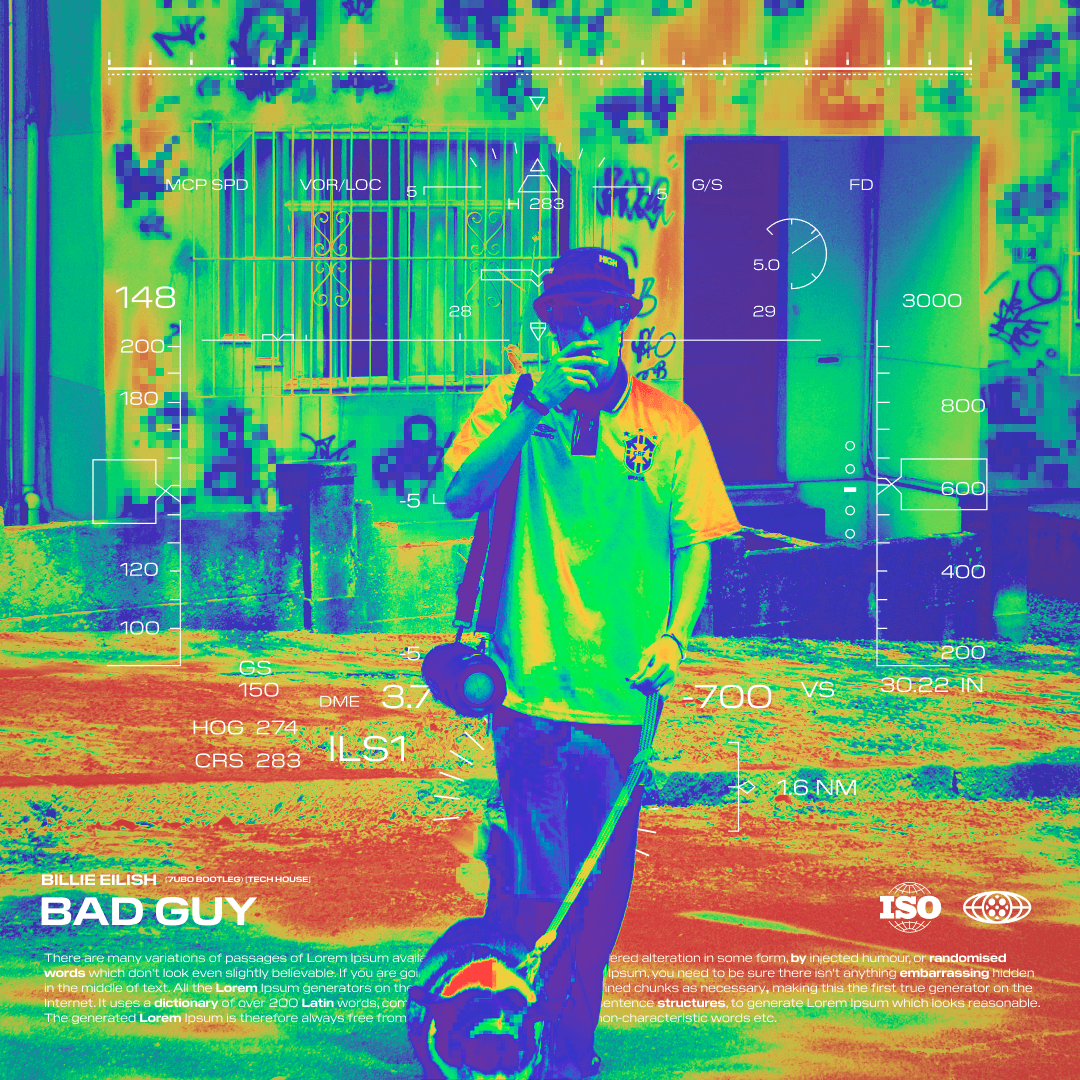
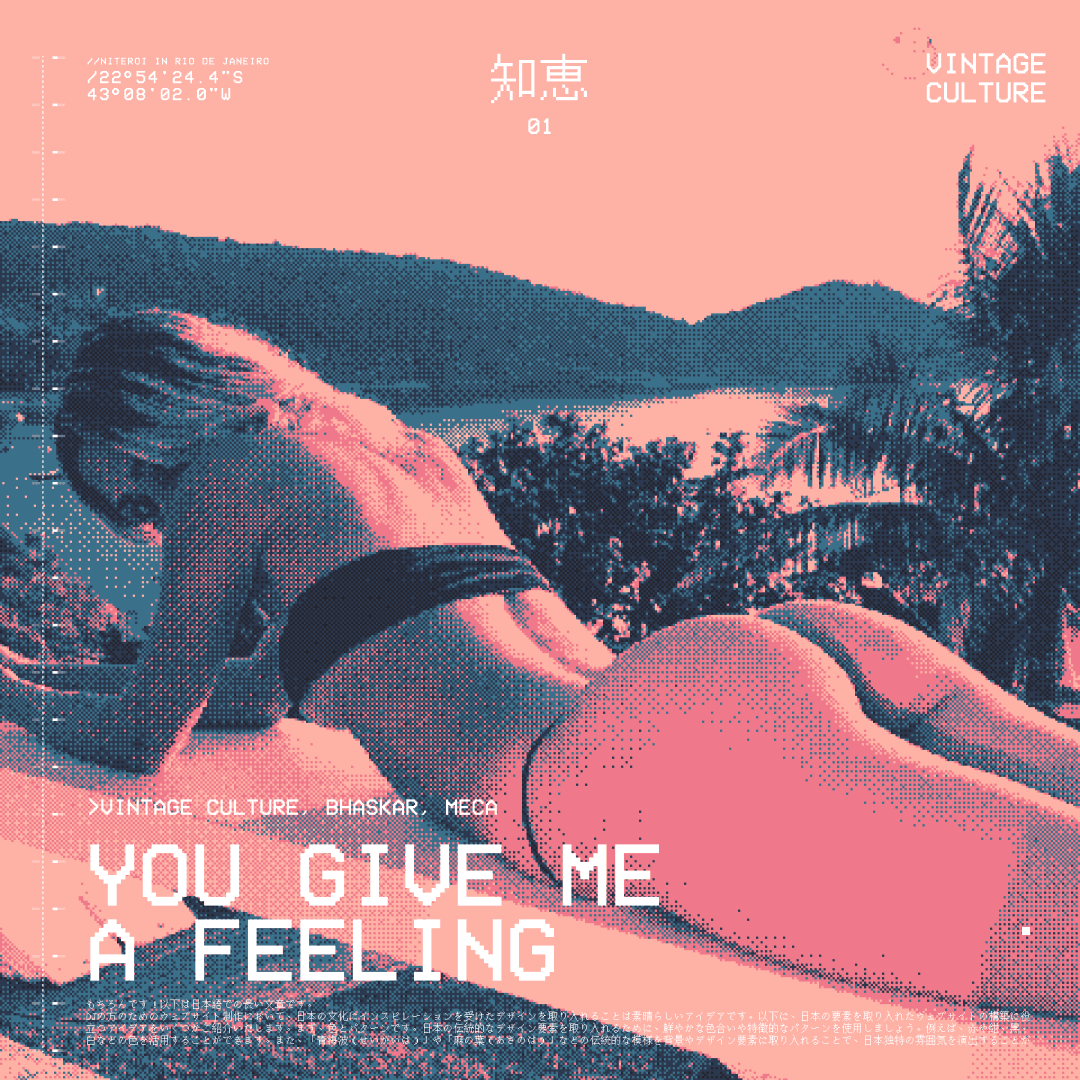
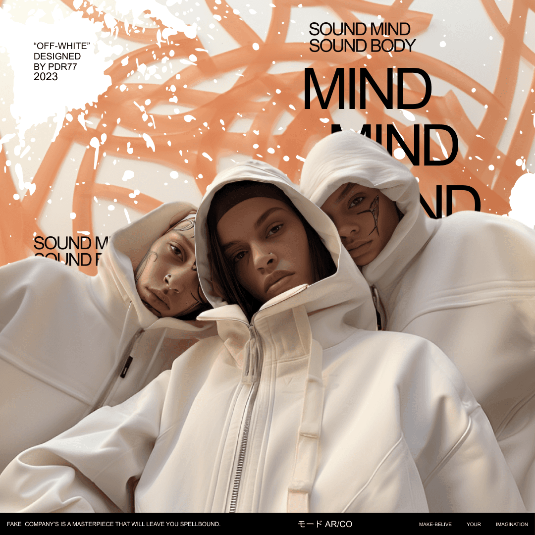
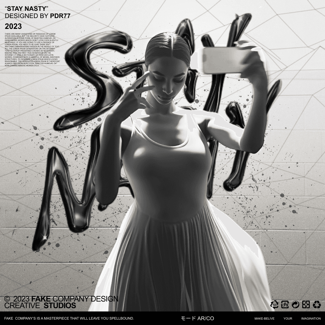
Brand New Branding
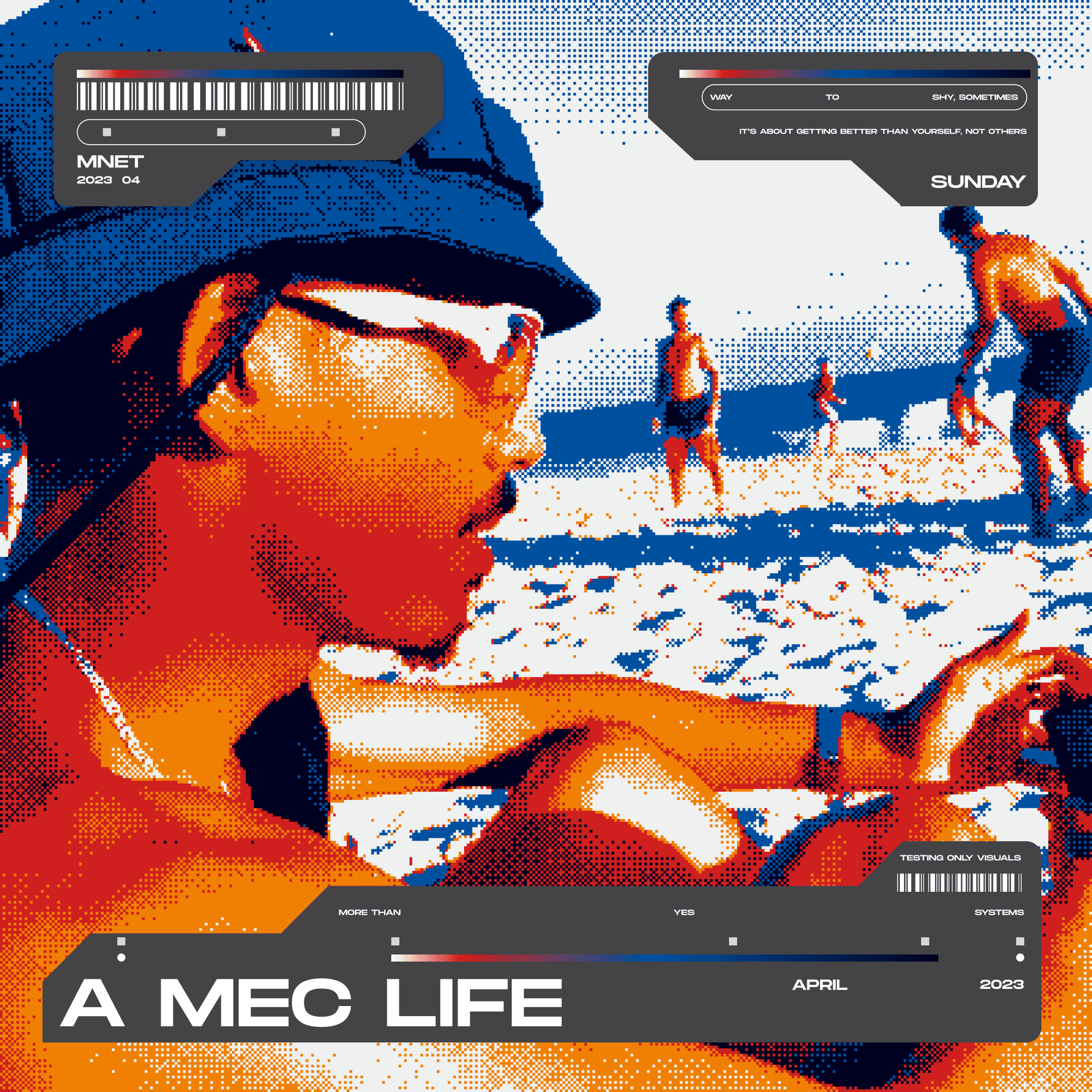
Challenge
1 - Balance between Aesthetics and Usability: The Brutalist style is known for its bold and unique aesthetic, however, finding the balance between an impactful appearance and a functional user experience can be a challenge. 2 - Clear Communication: Brutalist visual identity often employs abstract and deconstructed elements. Conveying information clearly and effectively can be tricky in this context. 3 - Audience Acceptance: Brutalist design can be polarizing, causing strong reactions of love or disgust. Ensuring that the target audience responds positively to the design is a critical challenge. 4 - Brand Consistency: Maintaining visual consistency across all aspects of the project, from the website to the printed materials, is complex due to the unconventional nature of Brutalist design.
Goal
1 - Differentiation from the competition: Use the brutalist visual identity to stand out in the insurance market, creating a memorable and unique brand. 2 - Lasting Visual Impact: Create a visual experience that stays in the minds of users, making the "Track Covers" brand unforgettable. 3 - Aesthetic Innovation: Explore new ways to present insurance information, leveraging brutalist aesthetics to reinvent graphics, icons and layouts. 4 - Coherence and Recognition: Develop a brutalist visual identity consistent across the platform, allowing users to immediately associate visual elements with the brand.
Solution
1 - Functional and Aesthetic Design: Collaborate with experienced designers who understand the principles of brutalism and their practical application, ensuring that the design is both attractive and functional. 2 - Visual Hierarchy Clarity: While brutalism is bold, implement a clear visual hierarchy and use easy-to-read typography to ensure information is understandable. 3 - Iterative User Tests: Conduct usability tests with samples of the target audience to assess their reactions and make adjustments as necessary. 4 - Brutalist Style Guide: Develop a detailed style guide that defines the elements, color palette and typography that should be used in all materials, to maintain visual cohesion.